
The digital town square erupted this week when Artemy Lebedev, Russia's most opinionated designer, squared off against critics of his Rzn city logo like a knight defending a dubious castle. In a live-streamed duel of wits with a blogger, the 53-year-old creative warlord dismissed detractors with the casual arrogance of a chef flicking crumbs off his Michelin stars.
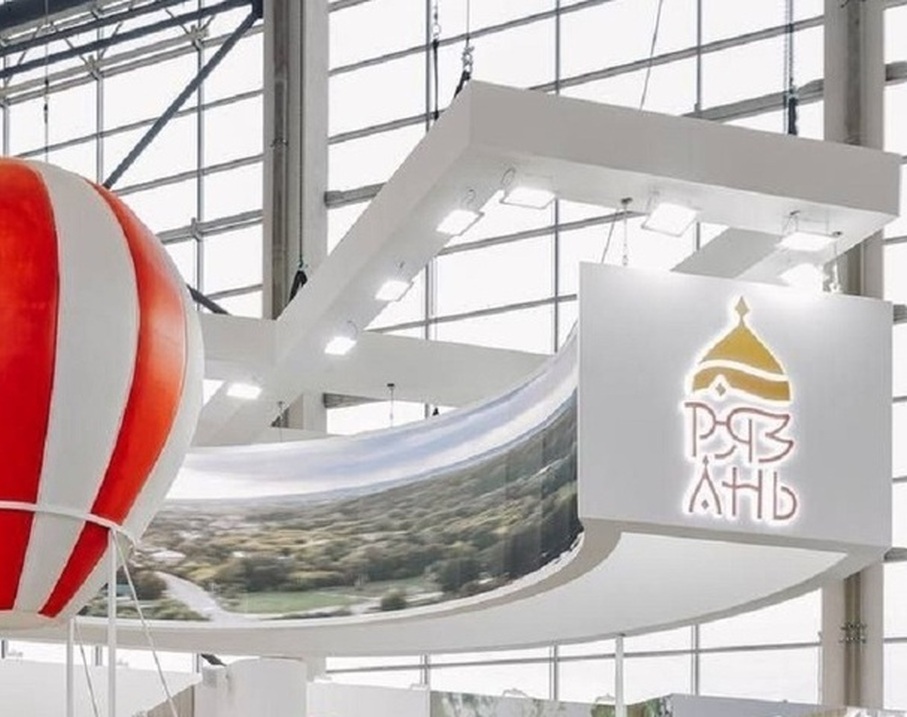
Lebedev's 2022 design - a typographic Rorschach test blending Monomakh's hat with what he insists are "friendly princely eyes" - became the visual equivalent of durian fruit: passionately loved or violently rejected. "It's just a picture," Lebedev scoffed, his voice dripping with the patience of a man explaining colors to bats. "Every souvenir kiosk vomits out hundreds of city logos daily. Ours at least came with an actual strategy."
The designer revealed his work was part of a larger "visual ecosystem" - a phrase that made municipal bureaucrats swoon but left locals scratching heads harder than deciphering the "secret river" supposedly hidden in the letter 'N'.
By 2025, the emblem's fate was sealed faster than a mayo-based picnic in August heat. City officials, perhaps tired of explaining why their branding looked like a medieval emoji, quietly retired it ahead of Rzn's 930th birthday. The decision united two normally warring factions: artists who called it "visual violence" and historians who deemed the winking prince "historically dubious".
Lebedev's response? A verbal shrug wrapped in designer jargon: "Brands evolve. Next." His studio's website still proudly displays the explanation - equal parts design manifesto and Rorschach test - where ordinary letters magically transform into "welcoming facial features" under the right... substances.
The saga proves even in Russia's heartland, design debates can spark more passion than politics. As one local commented: "At least it's not another boring coat of arms. That logo made us feel something - even if that something was rage."


